
eDetailer – Popup vs. sub-slide
"All additional information must be available, but that is too much content to fit on a single slide," is usually given as the reason. This is true: The content of a single slide in an eDetailer should focus on the core message and must be visualized accordingly. However, if there is relevant additional content, it makes much more sense to use sub-slides instead of popups.

A sub-slide offers more space for visualization, has its own name and key message, and is integrated into tracking by default.

What are sub-slides?
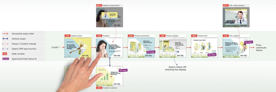
Sub-slides are regular slides, just like any other. The only difference is, they are not included in the core flow.
A sub-slide offers more space for visualization, has its own name and key message, and is integrated into tracking by default. Like any other slide, a sub-slide, can be included in flows and be used dynamically at different points in an eDetailer.
Using vertical swipe gestures (swipe gesture = basic gesture on tablets), multiple sub-slides can be easily accessed in the vertical flow of the corresponding main slide in the core flow (core conversation). To ensure smooth navigation using the horizontal swipe gesture on a sub-slide allows switching directly to the previous or next slide in the core flow.
Sub-slides should also be included in the sitemap of the eDetailer. They can be opened directly from the sitemap and offer a comprehensive overview of the slides available in the eDetailer as well as their connections – a real advantage for the planned overall conversation concept.

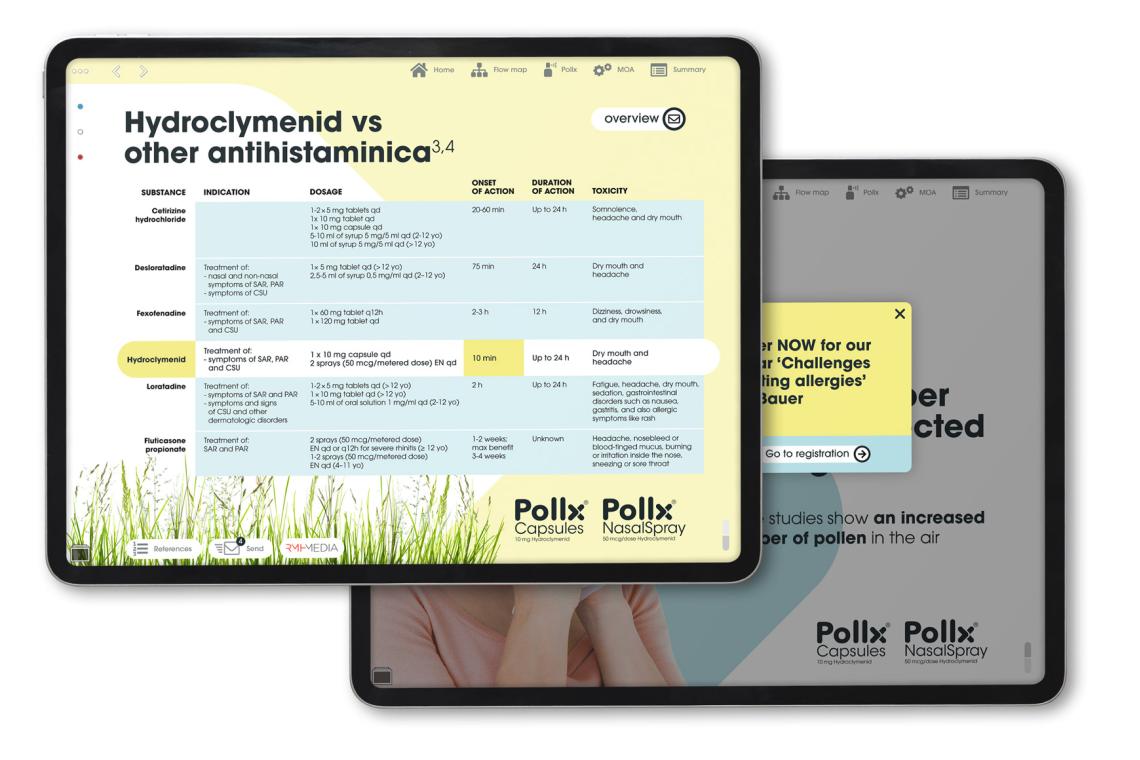
Popups are ideal for providing zoomed-in views of details, images or graphics, and for placing small additions within a slide.
In summary, popups or sub-slides are not an either-or proposition. Both are powerful tools that make an eDetailer really shine, if they are used correctly and purposefully.
It’s another one of those small but important details in eDetailers best practices for closed loop marketing.
Let's sit down anytime and talk about it ...

PopUp vs. Sub-slide
It’s another one of those small but important details in eDetailers best practices for closed loop marketing.